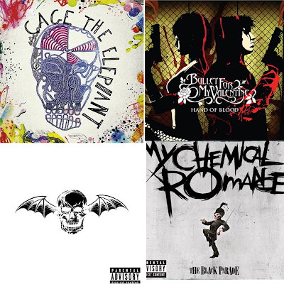
the following album covers are in front of me

the four covers are visually different it shows one with colour (riot girl) this represents the nature of the music sweet and innocent where as the bullet for my valentine it shows a more comic book effect with cartoonised characters but the colour is limited and black takes hold of the image throwing it into mystery. the first avenged sevenfold album cover shows the logo of the band this would make the buyer intrigued to see what they where about as it was something new simple colours say that they are not showy, and finally cage the elephants first ablum shows a lot of colour and say look at us, as this was their first album they wanted to get known and by making a album cover full of colour and life it shows who and what they are
album covers serve many functions such as promotion there are several more such as to get across the image of the band and to show what the band is about the more lively the colour the more lively the band and the more dismal the colour the more dismal the band ti represents who the band is and what they stand for you wouldn't expect a screemo band to have a bright pink album cover
The cover that i have decided to focus on is one from an anime called k-on! the art is from a band within the anime called Death Devil Love


Hence imagery used with in the album art love by death devil is some what different to normal album art as this is an album from an anime based band the images can be somewhat unrealistic and far fetched as with the 4 band members standing within flames and blue flames engulfing them. The back cover shows death holding the earth this could relate to the front cover somehow as though hell has escaped and is going to engulf the earth this is only achievable via animation and drawing the font for the word love is made to look like flames and is the opposite color of blue witch is red the word love is made to look like one with the flames obviously we know that this isn’t possible but because this is animation/ drawing it is possible. The front cover is made to draw people in as fans of the anime, which it is from K-on! Will know what it is from and will more than likely be drawn into it hence the little k-on! Logo in the bottom right corner people who don’t know about the anime would be drawing into it as it is extremely colorful and bright which is the complete opposite of the music witch is dark and dismal. The wardrobe of the band refer to what type of music it truly is as stereotypical that type of dress code is classed with goths/emos or metal bands. The potential audience of this album would be fans of the anime k-on! Which are teens from 14-20 as it is from a popular anime. The inner sleeve shows the song names and is deliberately in English as it has been translated into English for fans of the anime. The pure reason for the translation is for the audience to know who and what did recording etc it also shows a very dark picture of the band standing on the world.
No comments:
Post a Comment